Before launching my print-on-demand store, I needed a name and logo. while I was working at a supermarket, I kept a carton and pen in the fridge room, writing down words related to art, design, and color whenever inspiration struck.
One day, the combination clicked: Peackotint - Peacock + Tint. A name that captured color, creativity, and uniqueness.
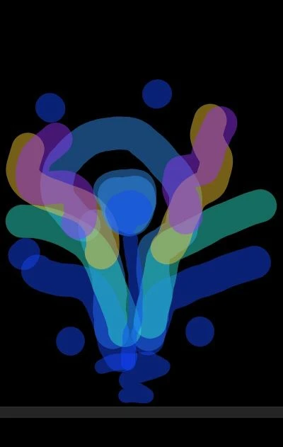
For the logo, I envisioned a peacock feather in blue and green with a paint drip at its center. After sketching it quickly on my phone and refining It in Inkscape, the final design came to life.
it took weeks of brainstorming, but the moment I saw the finished logo, I knew it perfectly represented my store.
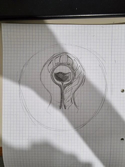
And from the moment the I found the name of the store I moved from this initial sketch of the logo
To this enhanced sketch
Then to the final result

What do you think?.